Cervis, Inc. Rebranding
After conducting extensive market and competitor research in early 2022, it became apparent that Cervis was blending in with the competition, as many of their top rivals were using the same color palette (black, white, with a shade of blue) and imagery styles. A re-brand was necessary and long overdue. At that time, the brand had been in use for over ten years.
The unique challenge of this series of tasks was to balance between a complete break from the current brand at the time (below), the history it represents, and the needed change in visual direction.

The solution was to create a framework for a gradual transition over a period time (three to five years) to accomplish the goal of elevating Cervis’ visibility among its current customer base as well as to provide a path to business growth through consistency and clarity of look, message, and presentation.
Transitional Brand
The first step was to complete a refresh of the brand that retains elements of the previous brand to ensure that current customers are still able to recognize it as Cervis, Inc. Elements retained included the flourishes from the original logo and the company typeface.
 Elements add or changed were the main corporate color palette, a change in the placement of the “Inc.” in the word mark, and the removal of the “pebble” or “rune” shape in exchange for a sharp edged square. Also added was a gradient overlay onto the color block.
The current brand has now been in place for just over 18 months and has received positive feedback from both internal and external stakeholders for it’s clean and recognizable look in both print (right) and online spaces.


Golvash & Epstein Vaccine Law Firm Corporate Identity
Golvash & Epstein is a law firm in suburban Pittsburgh that specializes in cases involving injury from vaccines and other medical treatments.
It was important to the partners that their brand be representative of what they do in their practice. Additionally, they expressed their desire to have the initials of the partners represented as well.
Therefore, the final brand incorporates both the “G” and “E” initials from the partners last names and also includes a graduated scale similar to those found on syringes used to deliver vaccines.
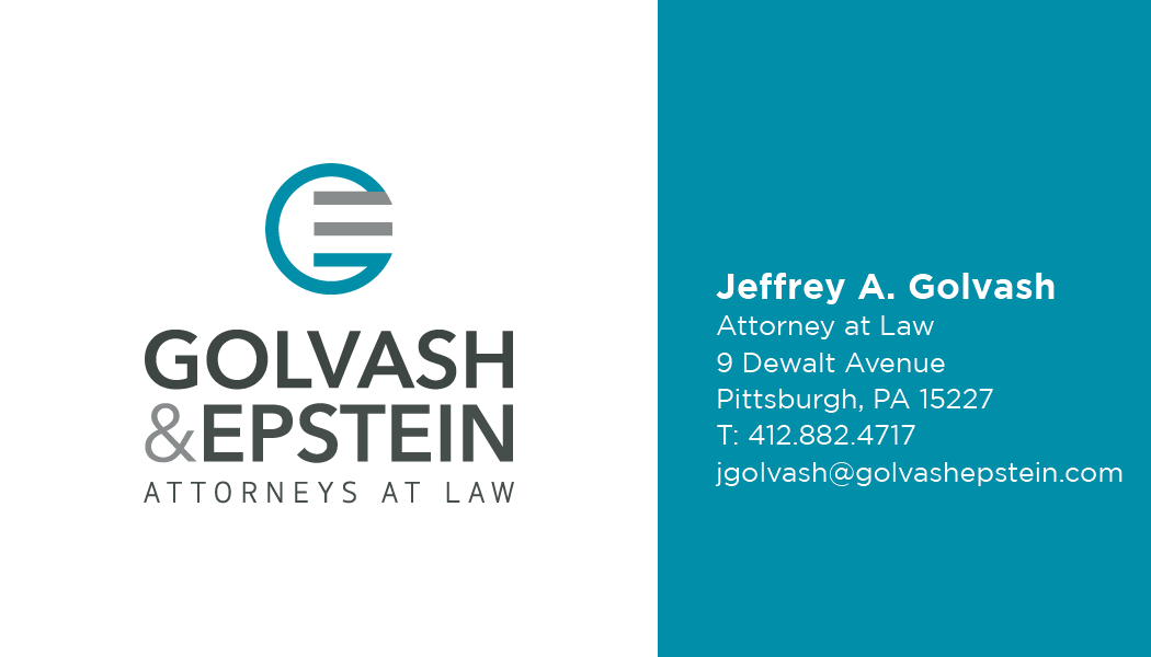
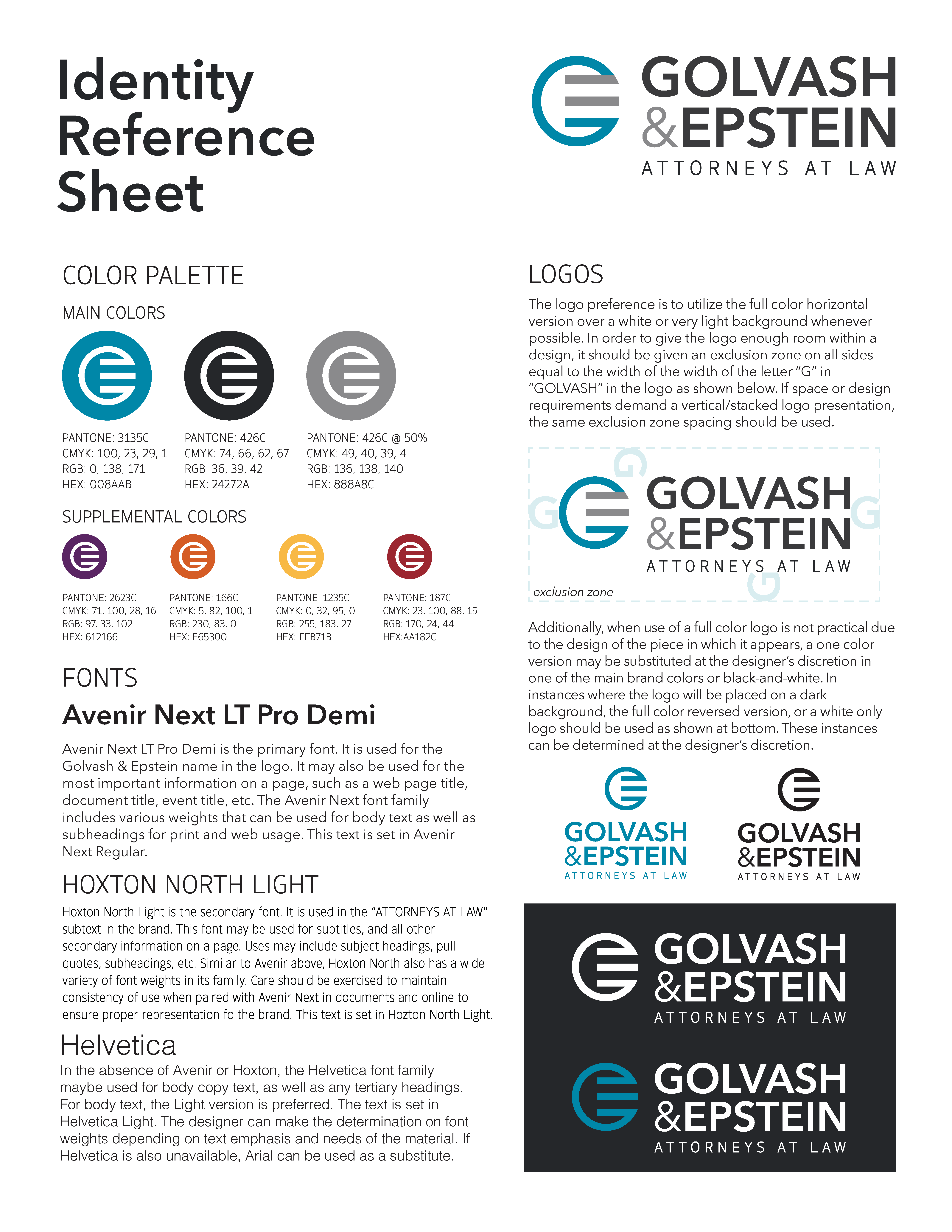
The image below is a business card that was included as part of a brand identity package that also included a reference sheet (right) that outlines the particulars of the brand including the color palette, typefaces to be used, and other information.
Watersheds of South Pittsburgh (WoSP) Branding
Watersheds of South Pittsburgh (WoSP) is a community-based volunteer organization that exists to ensure that the streams and creeks in their neighborhoods are clean for both wildlife and recreation.
After splitting off from a larger entity, the need arose for the group to brand itself to announce that it was now its own organization solely focused on its mission.
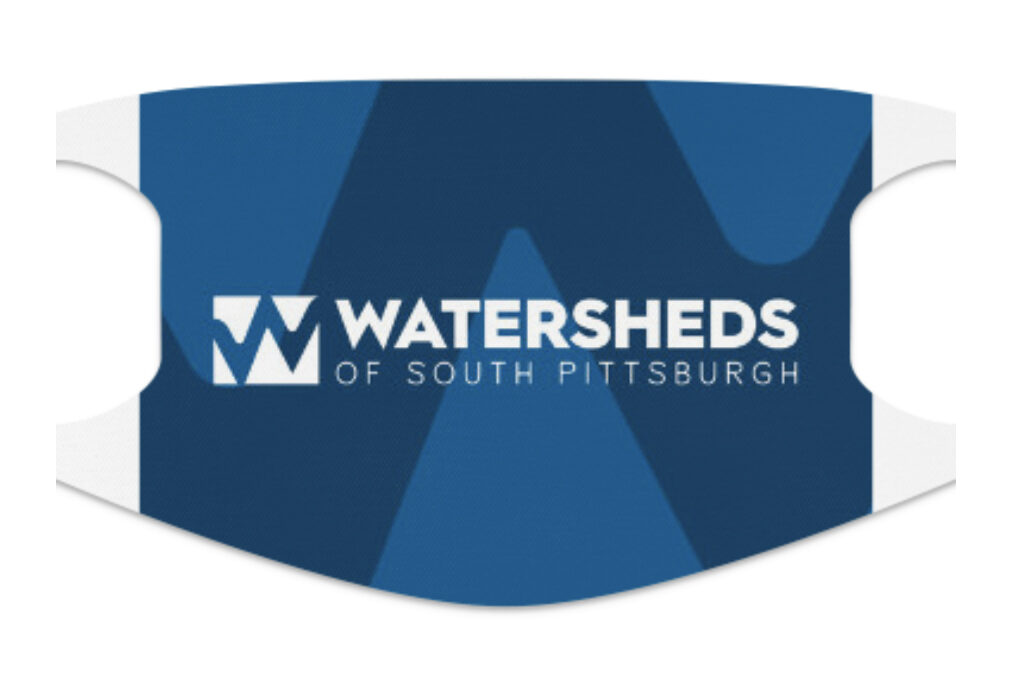
The new brand incorporates both land and water in a symbiotic arrangement that is accentuated by gradients to evoke the movement of flowing water. The negative space “W” also reinforces this concept.
The image below is a custom facemask that was created during the pandemic to allow the group to continue to hold activities in a safe manner. A reference sheet (right) outlines the particulars of the brand including the color palette and typefaces to be used.